Themes & Styling
Mantine Component Library
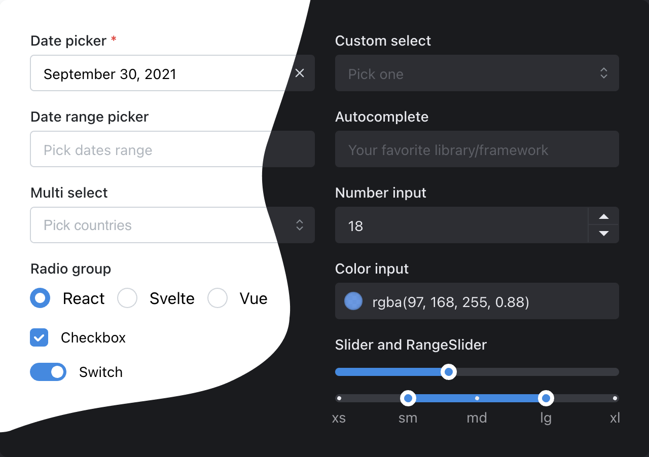
Mantine is used as a component library to allow for rapid UI development.

You can extensively style mantine components to your desire. See the styles documentation and themeing for more detail. We purposely try to keep the UI built in OneStarter close to the default Mantine styling so you can adjust to your look-and-feel easily.
We specifically avoided Shadcn and Radix-UI due to the inevitability of reinventing the wheel for each component. You can add these independently as you wish as they are lower weight libraries than Mantine.
There are many prebuilt resopnsive components with Mantine to choose from.
Icons
Radix-UI Icons are used throughout the project. Review their documentation for more info.
Can I use Tailwind?
Yes, of course. You can configure Tailwind with Mantine using PostCSS processing.
We recommend tailwind-present-mantine to get started.
However, it is important to note that CSS modules are closer to the actual CSS implementation, are more performant for local development, and recommended by Mantine components. While it is possible to use Tailwind, we do not implement it out of the box as a result.